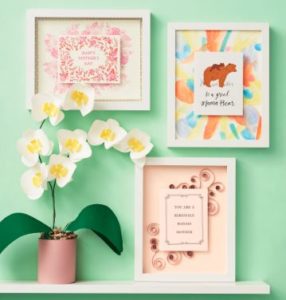
Posts Tagged inspiration
Bike love
Anytime we work on new product development at Paper Source, it starts with a creative idea and then it leads to seeking out visual inspiration. Right now we’re working on our 2011 Paper Source Wall Art Calendar, and we wanted to include one of my favorite icons: a bicycle.
I looked towards vintage bicycle posters to get inspired, before illustrating what could be a cute “Paper Source-styled bicycle”, for our colorful calendar. Here are some of the posters I’ve found that got me excited to start drawing— hopefully it’ll get you excited about next year’s calendar!
And just to share my love of bikes with you, here’s a photo my very own “Moss” colored bicycle that I ride to work when it’s not snowing in Chicago. I’ve photographed her behind my desk, in front of our PS calendar press sheets.
Go ride a bike, get inspired by the day, and stay tuned to see how our bike calendar page for 2011 turns out!
Cheers,
–Elaine
PS colors: moss/blossom & fuchsia/khaki
Latest fave: Bicycle with Basket Rubber Stamp
Where Women Create featuring Paper Source CEO
These wise words of advice from our CEO, Sally Pofcher, are captured in a wonderful behind-the-scenes article about her role at Paper Source. Check out the 10-page spread in the spring 2010 issue of Where Women Create!
– Carolyn
PS colors: moss & papaya
Latest fave: Desk Embosser
Introducing the 2010 Paper Source Wedding Invitation Collection!
We are thrilled to introduce the Paper Source 2010 Wedding Invitation Collection – now available in stores and on our website. What labor and love the teams here at PS put into the design and execution of this year’s wedding invitations. Planning our collection was not unlike planning an actual (BIG) wedding, just without the pretty dress, fancy cake and amazing party!
To kick off the development of our new wedding invitation collection, we began by creating an inspiration board. We looked at current trends in color, pattern, fashion and design, and gathered things we love – buttons, bits of lace and fabrics, branches and flowers. We also considered feedback from our wonderful customers about what was missing from our 2009 collection, and what they loved!
Much of this inspiration and insight eventually made it into the 2010 wedding collection in the design of our new embossed Faux Bois invitations; the introductions of curry and beet letterpress ink colors; the whimsy of the Carnival suite; and the much desired inclusion of black and white patterns and styles! In addition to beautiful wedding invitations and save the dates, we also created wedding guest books and rubber stamps that coordinate with many of our new designs so you can carry a theme throughout your wedding.
P.S. In planning your wedding, consider building yourself an inspiration board. You’ll have such fun doing it and it will remain a great reference for you throughout your planning process. And, when you’re happily married, it will be a wonderful remembrance of all the planning, labor and love that you put into your big day!
– Karen and Cindy
PS colors: moss & papaya and pool & red
Latest faves: India Calico File Folders and Dutch Woodcut Floral Wrapping Paper
2009 holiday card contest winner – website submissions
You have truly inspired all of us here with your creativity and craftiness in your submissions to our 2009 Holiday Card Contest! Below you will find some of our customers’ homemade holiday cards that were web submissions, separate from the store submissions (to be featured soon). We’re sure these will make you ooh and ahh, just as they made us!
This year’s website submission winner is MaryDawn from Rockford, Illinois. This stocking card with the adorable face of Demi stole our hearts! We love the Chartreuse Dots lined envelope that coordinates with the hand cut stocking….the complimenting colors…and all the details (tiny punches, rubber stamping, ribbon embellishment, and Joy envelope seal). Needless to say, this holiday card received tons of votes from the employees here.
Perhaps these cards will inspire you to GET YOUR CARDS IN THE MAIL (Christmas is right around the corner)! Wishing you all a very healthy, happy and peaceful holiday.
–Linda
PS colors: chartreuse & pool
Latest fave: Saddle Stitch Notebooks
European-inspired colors: Part 2
When I travel abroad, I take a few photos of famous monuments and statues. But what I really love to capture are common elements like doors and windows. And the most remarkable to me are not the ornate or gold-plated, but the understated ones on tiny storefronts and countryside homes…the ones the locals walk through and look out everyday. Simple and modest, but so rich in color, texture, and feeling.
It’s fascinating the way that color is used in architecture throughout Europe. Homes and businesses show off their personalities by washing their walls in color, or using colorful doors and shutters as accents. Sometimes it’s nature creating the final color as with the rustic green patina that develops over metallic surfaces. Even if the colors are vibrant they feel demure, never flashy.
Photographs like these inspire me to pause for a moment at the everyday things… and remind me why I love to travel!
–Kristen
PS colors: pool & chocolate
Latest fave: Gold, Pink Dots Nesting Box – great to have around for last minute gift wrapping.
European-inspired colors: Part 1
I’ve already professed my love for the farmer’s markets here in Chicago, but if I had my way I would spend my time traveling through the markets across Europe. There’s something about the way they present the food and the idea that locals go there everyday to buy fresh ingredients for that night’s meal. Set up in open plazas or packed into narrow cobblestone alleys, they are always charming and always inspiring.
While looking through photographs from my friend’s recent trip to Italy, I was reminded both of my nostalgia of such magical places and of the incredible colors that can be found in the simplest and most natural of items. Produce especially offers an unimaginable array of colors – even the understated muted tones are exquisite. If I could paint my world in these purple artichokes, I would!
–Kristen
PS colors: pool & chocolate
Latest fave: Gold, Pink Dots Nesting Box – great to have around for last minute gift wrapping.
Nature-inspired color combinations
Every Saturday morning I look out my 15th floor window to the tiny farmer’s market that sets up just a block away from my apartment. I can’t wait to walk by each stand to see the fresh produce picked just days earlier. But my favorite is the fresh cut flower selection. Many times I don’t even buy anything, but I still enjoy exciting my senses – the variety, texture, and infinite color combinations nature allows is inspiring.
Something I’ve learned from flowers is that there are no wrong color combinations. In fact experimenting can lead to the most unexpected and wonderful color combinations. This past weekend I picked up some cockscomb in curry, red, dusty pink and deep purple. Accented with bright green leaves, it’s truly perfect. I can’t stop staring at them on my dining room table.
For me the lesson learned is don’t be afraid of color, of mixing colors, and taking tips from nature!
–Kristen
PS colors: pool & chocolate
Latest fave: Gold, Pink Dots Nesting Box – great to have around for last minute gift wrapping.
A new take on the classic paper doll
We thought we’d start sharing some of the doll creations that have been circulating the halls here. (The dolls shown here were created by Haley, daughter of Rhonda in HR, with some help from brother Evan, and by our summer intern Tracy.)
More to come — we hope you enjoy this new kit as much as we do!
P.S. A great tip from Crysia, the store manager at PS in Boston: in addition to the removable adhesive dots in the kit, try using Xyron repositionable adhesive for doll clothing and accessories– great for using those outfits again and again.
–Fabra
PS colors: gravel & chocolate
Latest fave: Teflon bone folder


Clockwise from top left: ballerina and go-go gal made by Haley; pilot made by Tracy; robin hood and redhead made by Haley and Evan.
The little calendar that could
At Paper Source, we’re constantly working to come up with interesting and beautiful ways to do calendars. Last year, we launched our first wall art calendar, a large-scale poster display of gorgeous saturated color. This year, we had a “paper engineering” brainstorm to come up with a fun new take on a monthly calendar– we were aiming for something neat and small, yet super utilitarian. And thus was born the Mini Calendar. It’s so multi-talented, we like to think of it as our little workhorse. Read the rest of this entry »


