At Paper Source headquarters, here in Chicago, the winters are long and a bit bleak. So, a little color is always welcome. For one of the first birthdays of the year we created a colorful banner – Estela was so surprised to get her very own rainbow birthday banner!
-
How-to: colorful birthday banner
-
European-inspired colors: Part 2
When I travel abroad, I take a few photos of famous monuments and statues. But what I really love to capture are common elements like doors and windows. And the most remarkable to me are not the ornate or gold-plated, but the understated ones on tiny storefronts and countryside homes…the ones the locals walk through and look out everyday. Simple and modest, but so rich in color, texture, and feeling.
-
European-inspired colors: Part 1


I’ve already professed my love for the farmer’s markets here in Chicago, but if I had my way I would spend my time traveling through the markets across Europe. There’s something about the way they present the food and the idea that locals go there everyday to buy fresh ingredients for that night’s meal. Set up in open plazas or packed into narrow cobblestone alleys, they are always charming and always inspiring.
-
A baby shower for one of our own
We talk a lot about color around here, but it really can be inspirational. A room painted in yellow can leave you feeling sunny and pair of great pink shoes can make you smile. The same is true for inspiring memorable details for any event. Recently, we had the pleasure of hosting a baby shower for one of our coworkers. We used her nursery colors – night and chartreuse (gender neutral since the sex of the baby was going to be a surprise) – as the jumping off point for all of our decorations.

-
Nature-inspired color combinations
 Every Saturday morning I look out my 15th floor window to the tiny farmer’s market that sets up just a block away from my apartment. I can’t wait to walk by each stand to see the fresh produce picked just days earlier. But my favorite is the fresh cut flower selection. Many times I don’t even buy anything, but I still enjoy exciting my senses – the variety, texture, and infinite color combinations nature allows is inspiring.
 -
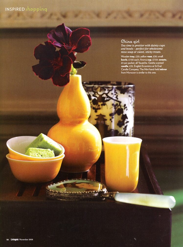
Color play: curry

Image courtesy of Livingetc Magazine
I wanted to share this cool study in color & texture contrast that I stumbled upon in my magazine archives, from Livingetc (one of my favorite home design magazines out of the UK). Color is such an integral part of Paper Source– if you haven’t yet, check out our colorscope— and the vibrant yellow in this image reminds me of how our curry is a beautiful match for almost any deep purple. This particular vase with its glossy finish, set against the deep dark richness of the flower, and the highlights of its edges and velvety texture… all create a bounty of visual fun! Whether it’s a vase and flower combination like this, or a shirt and a scarf, or a card and envelope pairing…there are countless ways to mix this gorgeous color combo into your everyday life.
P.S. view the photo full-sized to get the full effect.
–Fabra
PS colors: gravel & chocolate
Latest fave: Teflon bone folder -
Inspired by India

Each year, the PS Design team works together to create a new paper collection. This has become one of the projects we most look forward to– a wonderful mix of inspiration, creativity and collaboration (and long, long hours, thoughtful conversations and many, many revisions…the list goes on!).
After a trip to Asia last year, our founder Sue came back inspired to create a paper collection about India– what struck her most was all the COLOR, everywhere, as she traveled through the country.
-
What’s your Colorscope?
 Though I’ve been doing it for nearly 7 years, mixing and matching Paper Source colors never gets old – I continue to be amazed by how well they work together (despite knowing they were designed with that intention!). Like our color palette, our “Colorscope” is also about coordinating colors– and then learning how those colors reflect your personality. Our founder Sue felt that a person’s favorite colors revealed something interesting about them, and thus was born the Colorscope. Try it, pick out your two favorites (mine, at the moment, are classics Chartreuse and Pool) and read what they tell you about yourself. Just as I’m wowed by how our colors work together, I’m blown away by how my favorites really speak to who I am. Try pulling the Colorscope out at your next fete, we find it’s a great icebreaker – and who knows, could even become a matchmaker!
— Cindy
PS colors: chartreuse & pool
Latest fave: PS Wall Calendar — it’s wonderful to look at across the room.


